Lesson 10: Building Layouts
Layout Analysis
You now know a good bit about how to work with CSS. We've discussed how to select and apply styles to HTML elements, how to style content, work with the box model, and, finally, how to build some basic layouts with all these skills in combination with basic float and clear settings.
Now I'd like to outline for you a process you can follow for larger more complex layouts. It begins with layout analysis, where you first inspect your comp in order to plan the approach you'll use with CSS. We'll make identify rows and columns that will translate to specific CSS settings.
Definitions
Tiles are discrete groups of elements that are laid out beside other groups of elements, or are grouped with elements that do. For the sake of layout analysis, I suggest highlighting tiles using a blue line or box.
Containers are groups of tiles. For the sake of layout analysis, I suggest highlighting columns using a red line or box. While there are many elements that act as containers in a given document, layout Containers only need to be marked as such when they contain two or more tiles.
Process
With a particular design comp open, follow this process in order to identify tiles and containers:
- Sketch: Sketch your layout on paper in light pencil or light grey ink.
- Group: Identify groups of elements and outline them with a dotted black box. Start by identifying small groups, and move outwards to larger groups or even groups that contain smaller groups.
- Identify tiles: Identify either individual elements or groups that are presented beside other groups as tiles and highlight them with a blue box.
- Identify containers: Identify containers for sets of related tiles by highlighting them with a red box. There are a few nuances to consider here:
- The simplest container is one that neatly naturally wraps around an obvious set of tiles, such as a container around a list of product image thumbnails.
- Sometimes the best container is a group that contains groups that you recognized as tiles and others that you didn't. In order for this container to be such a container, we'll have to realize that the groups we didn't call tiles before can actually be tiles, but just set to fill the container's width. In this case, identify the other groups as tiles by adding a blue box around them as well.
- Finally, some containers are themselves tiles. They are tiles in that they themselves are presented beside other groups and part of a larger container. They are containers in that they contain nested tiles. In this case, identify the tile as a tile/container combo by adding a dotted red box outside the blue box already in place.
Exceptions
Watch for the following exceptions as you analyze your comp:
| Description | Sample |
|---|---|
| Background layering — If you have a section in the comp where a set of text is laid out overlapping with the image as a background, the image should be seen as a background of an element and not as a tile for layout analysis. Just be certain that there is really one set of content with each element stacked on top of the other; otherwise, there might be tiles inside of a container that lay over the image. | 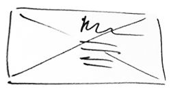 |
Natural Float — If you have a section on your comp where an image or set of elements is hanging out on one side or the other of some text that is just flowing around it, you probably don't have a true tile, but, rather, just a natural float. Use the float property to create this effect on that element or group. | 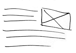 |
Building Tiles and Containers
Once you've completed the Layout Analysis you are ready to move into building out the comp, a phase I call Reconstruction.
The rows and columns you identified in Layout Analysis can be built out by applying the following style sets to each corresponding element:
Containers:
[container selector] {
    display:flex;
    /*
        Other settings optional such as
        - justify-content
        - flex-flow
        - align-items
    */
}
Tiles:
[tile(s) selector] {
    box-sizing:border-box;
    /* width setting */
    /* margin and padding as needed */
}
We'll look at a series of common layout patterns in Lesson 12.
Process for Building Layouts
With this basic understanding of the CSS you need in order to build rows and columns you must also note that the they don't just invent themselves in your markup. As you work to create the markup your layout demands, start with content markup as we discussed in Lessons 1–3, and 5. Then use the sectioning tags and <div> tags we learned in Lesson 4 to add groups wherever they're needed. If a row or column includes multiple elements, consider using the most semantic grouping element you can in order to create such a group.
Suggested Process
Use this process to complete the reconstruction in a methodical, efficient way:
First, create simple, clean, semantic HTML based on the content in your comp. You might also benefit from some simple grouping with
<div>tags. Use theclassattribute to distinguish such a group from other groups.Through Layout Analysis you identified tiles and containers. With basic HTML in place you must now ensure that your simple, semantic HTML is also compatible with the tile and container structure you identified.
- Tiles should alway be a single element. This means that you will need to ensure that each thing you marked as a tile in your analysis is either already a single element or is a collection of elements grouped together by a single
<div>or other more semantic option. - Containers should be the direct parent element of the set of tiles you mean to display as tiles. Often these will naturally be the closest grouping element, but if a simple single element does not wrap around your tiles, you might consider adding such an element.
<div>with a meaningful class is usually a safe option here.
Bottom line here is that you must have markup that matches your analysis: Tiles must be a single element and the container must be the direct parent of all the related tiles.
- Tiles should alway be a single element. This means that you will need to ensure that each thing you marked as a tile in your analysis is either already a single element or is a collection of elements grouped together by a single
For each container you identified, you must select it and turn on
display:flex. You might also benefit from one or more of the following also set on this container:flex-flow— if your set of tiles spans more than one "row" in the layout turn this setting on, and set it torow wrap. There are other settings for this property, but this is the most common. You'll likely want to control such an element's width to ensure tiles it contains wrap in the desired space.justify-contents— this setting helps with some spacing scenarios. You can experiment with the following to see if the desired results fit your comp closely enough:center— helpful for creating a center-aligned flow for the set of elements.space-between— helpful when you have a few items in a single row and want the outer two hugging the outer bounds and the inner ones spaced evenly from each other.space-around— helpful when you have an even gutter between each tile and space on the outside gutters that is half of the inner gutter.If these do not suffice, you may need to move on to specify spacing on the tiles themselves.
Move to the tiles inside this container and, if needed, specify a
widthsetting to ensure they each occupy the desired space. In addition, if some of the flex box settings from the container do not have the desired effect for spacing these elements, add margin and/or padding and other box model settings as needed.
Continue to refine styles overall to ensure all aspects match the desired style.
Layout Patterns Introduction
Most layouts on the web can be created easily with the flex box settings. There are a relatively small number of patterns that can be applied to such situations.
First conduct layout analysis in order to identify rows and columns. Then, consider which of the patterns that follow fits each row the best. Apply the overall settings but customize the particular values as needed.
Layout Pattern A: Row on its own
The simplest pattern to build out is a row of content that contains no actual columns; all elements inside the row stack on top of each other according to default behavior. In such a case DO NOT use display:flex on the row; I'm calling these out to show you many things that can be done without flex box.
A1: Row spanning full width of outer container
A row on its own might simply span all or most of the width of its container:
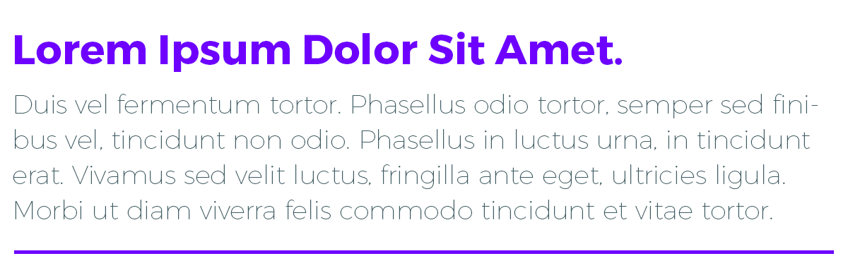
HTML:
<div class="intro">
    <h2>Lorem Ipsum Dolor Sit Amet.</h2>
    <p>Duis vel fermentum tortor...</p>
</div>
CSS: only add settings for border and spacing if needed. DO NOT use display:flex; on such a row.
A2: Row with restricted width
A row on its own might also have a restricted width but nothing on either side of it:
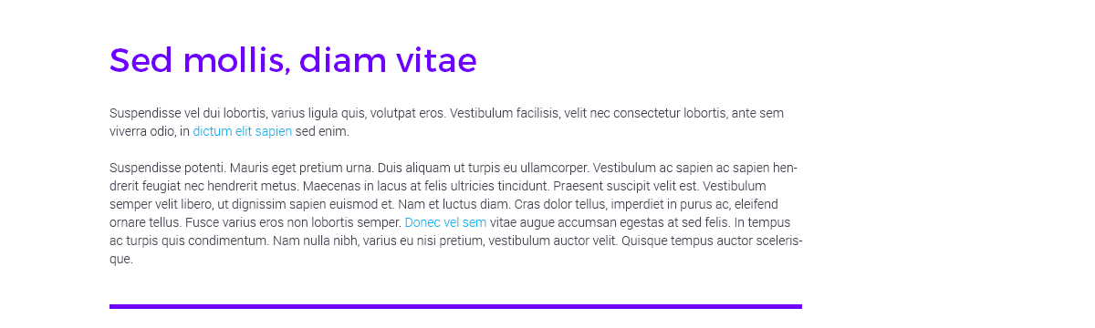
HTML:
<div class="followup-1">
    <h2>Sed mollis, diam vitae</h2>
    <p>Suspendisse vel dui lobortis...</p>
    <p>Suspendisse potenti. Mauris...</p>
</div>
CSS: Set the restricted width and spacing as needed. In this case:
.followup-1 {
    margin:0 0 20px 120px;
    width:760px;
    padding:30px 0 20px;
}
A3: Centered row with restricted width
A row on its own with a restricted width might be intended to appear "centered" inside its overall container. Such a setup is simpler:
HTML:
<div class="followup-2">
<img src="images/followup-2.png" />
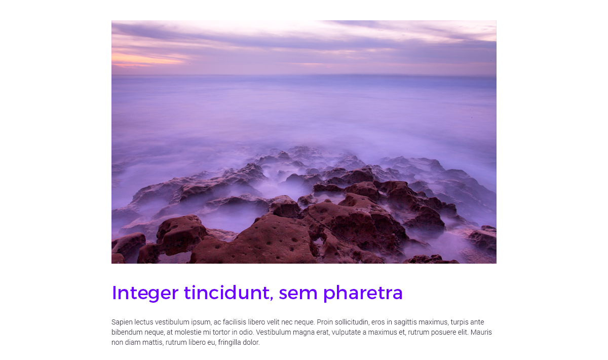
<h2>Integer tincidunt, sem pharetra</h2>
<p>Sapien lectus vestibulum...</p>
</div>CSS: Simply set the restricted width and then use auto for the left and right margin such as:
.followup-2 {
    margin:20px auto 40px auto;
    width:760px;
}
You'll often see me use a width plus margin:0 auto to center a layout element.
A4: Row on its own with background image
Another common variation of the row on its own is the "faux column" we discussed earlier. Here there is still only content inside the row stacked one on top of the other, but it feels different because there is also a background image that adds the impression of another column or other content. Whether the content is centered or offset in some way, we'll have to use padding to create the offset. We cannot use auto with padding as we did with margin but must instead use a valid dimension using pixels or percentage. Sometimes a height setting also comes in handy.
HTML:
<div class="followup-3">
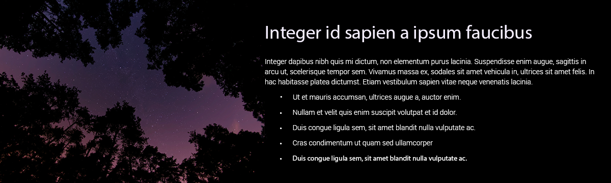
<h2>Integer id sapien a ipsum faucibus</h2>
<p>Integer dapibus nibh quis...</p>
<ul>
<li>Ut et mauris accumsan...</li>
<li>Nullam et velit quis enim...</li>
<li>Duis congue ligula sem, sit...</li>
<li>Cras condimentum ut quam...</li>
<li>Duis congue ligula sem, sit...</li>
</ul>
</div>CSS: Here we assume width is either 100% or the default width value and just adding padding and a height setting. box-sizing:border-box also often proves useful here.
.followup-3 {
    background:black
        url(images/followup-3.png)
        left top no-repeat;
    box-sizing:border-box;
    padding:30px 20px 0 520px;
    height:360px;
}
HTML:
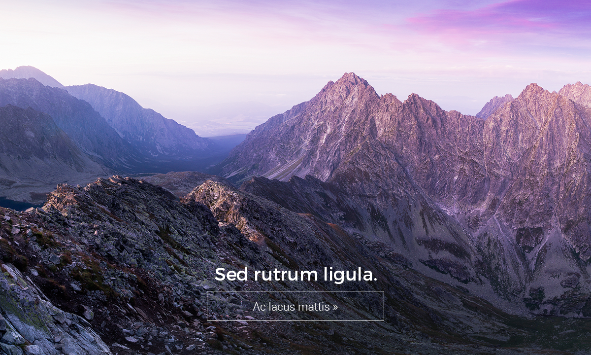
<div class="hero">
<h2>Sed rutrum ligula.</h2>
<a href="#">Ac lacus mattis »</a>
</div>CSS: Here as in the previous example we use padding and height with the background settings to achieve the overall offset. But we've also center-aligned the text for the <h2> and the <a>.
.hero {
    background:url(images/hero.png)
        top center no-repeat;
    box-sizing:border-box;
    padding:520px 420px 0;
    height:720px;
}
.hero a {
    border:1px solid white;
    display:block;
    text-align:center;
}
.hero h2 {
    text-align:center;
}
Layout Pattern B: Row with columns
Building off of the basics or working with rows, we next examine patterns that make use of columns in various forms.
B1. Equal-sized columns
When all the columns inside a row are the same size the solution can be very simple, especially if all the items are the same element or have a class in common. Just use a nested selector in order to provide styles for the whole set of elements.
HTML:
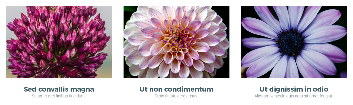
<ul class="categories">
    <li>
        <a href="#">
            <img src="images/category-1.png" />
            <h3>Sed convallis magna</h3>
            <p>Sit amet orci finibus...</p>
        </a>
    </li>
    <li>
        <a href="#">
            <img src="images/category-2.png" />
            <h3>Ut non condimentum</h3>
            <p>Proin finibtus eros risus.</p>
        </a>
    </li>
    <li>
        <a href="#">
            <img src="images/category-3.png" />
            <h3>Ut dignissim in odio</h3>
            <p>Aliquam vehicula quis arcu...</p>
        </a>
    </li>
</ul>
CSS: The flex:1 setting is a flexible way to set them all to the same size but feel free to set a pixel or percentage value instead if you like.
.categories {
    display:flex;
    justify-content:space-around;
    margin:0;
    padding:0;
}
.categories li {
    flex:1; /* or a width setting */
    margin-bottom:20px;
    list-style:none; /* disables bullets */
}
Sometimes you might find that you need to adjust either the first item in the set or the last item in the set (such as to cancel a border or some spacing). Keep in mind that you can set up the overall settings with a broad selector as described above but then provide an override setting using the :first-child or :last-child pseudo-class selectors.
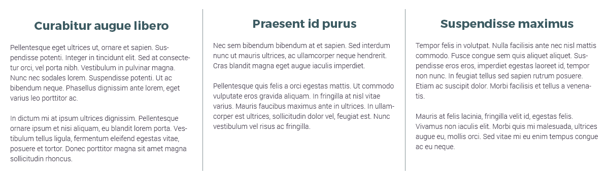
HTML:
<div class="leaders">
    <div class="lead">
        <h3>Curabitur augue libero</h3>
        <p>Pellentesque eget ultrices...</p>
        ...
    </div>
    <div class="lead">
        <h3>Praesent id purus</h3>
        <p>Nec sem bibendum bibendum at...</p>
        ...
    </div>
    <div class="lead">
        <h3>Suspendisse maximus</h3>
        <p>Tempor felis in volutpat...</p>
        ...
    </div>
</div>
CSS: Here we put a border on the right side of most elements but cancel it on the :last-child. As a result we have reverted to using padding to space the items side-to-side instead of justify-contents on the container.
.leaders { display:flex; }
.lead {
    flex:1; /* or a width setting */
    padding:20px 20px 0;
    margin:20px 0;
    border-right:1px solid #869396;
}
.lead:last-child { border-right:none; }
B2: Uneven columns
On the other hand, if the columns inside the row are different sizes, its best to target each individually and set the desired size.
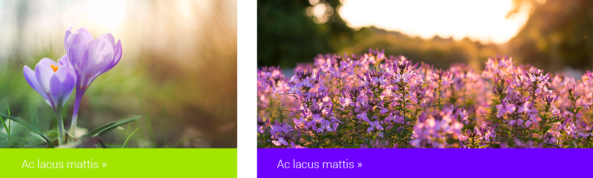
HTML:
<div class="features">
    <div class="feature left">
        <img src="images/feature-left.png" />
        <p><a href="#">...</a></p>
    </div>
    <div class="feature right">
        <img src="images/feature-right.png" />
        <p><a href="#">...</a></p>
    </div>
</div>
CSS:
/* Key settings for the layout */
.features {
    display:flex;
    justify-content:space-between;
}
.features .left {
    width:480px;
}
.features .right {
    width:680px;
}
/* Other settings you might find helpful here */
.features a {
    padding:20px;
    display: block;
    color:white;
}
.features img { display:block; }
.features .left a { background-color:#a2e500; }
.features .right a { background-color:#6e00ff; }
B3: Spacing columns
Adding onto B1 and B2, if you need spacing (whitespace) between columns, your solution should depend on whether the columns have a background image or color, or if there’s a border between the columns.
- No backgrounds — in this case it is simplest to use
paddingto enforce the spacing. Thanks tobox-sizing: border-boxyou can keep thewidthset at the total space a column occupies and add padding inside of that space. See how spacing is established in the example provided with B1a. above. Alternatively, setjustify-content:space-betweenon the row instead to make this even simpler. - No backgrounds but a border in-between — you can actually follow the same pattern as above and use padding in combination with
width,border settings, andbox-sizing:border-box. See how spacing is established in the example provided with B1b above. It might not be helpful to usejustify-content:space-betweenin this situation. - Backgrounds, with or without border — in this situation, you need to use
paddingto provide the desired inset spacing between the text content and the outer edges of the background. This is much simpler if you’re also usingbox-sizing:border-boxsince this allows both padding and border to be included in the width setting. But spacing outside the edges needs to be accomplished withmargin. See how spacing is established in the example provided with B2 above. Here thejustify-content:space-betweensetting is once again very helpful.
B4: Centered columns
Flexbox makes centering columns very easy. The justify-content:center setting achieves this affect. In this case flex:1 on the items will lead them to all be the same width but fill the whole row. If this is not desired use a width setting on the items instead.
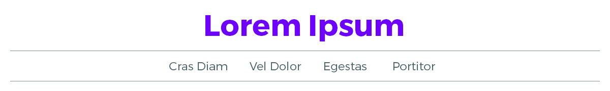
HTML: Here the header ul gets treated like a row as opposed to the whole <header>. We're showing the larger context for your benefit.
<header>
    <h1>Lorem Ipsum</h1>
    <nav>
        <ul class="row">
            <li><a href="#">Cras Diam</a></li>
            <li><a href="#">Vel Dolor</a></li>
            <li><a href="#">Egestas</a></li>
            <li><a href="#">Protitor</a></li>
        </ul>
    </nav>
</header>
CSS: Here we use the very helpful center setting for justify-content to quickly ensure the li elements align on the center axis. Note that instead of flex:1 though we need a width value to ensure the items don't just fill the container. We use auto to just allow the elements to be as wide as their contents demand. We then use margin to enforce even spacing between the items.
header ul {
    justify-content:center;
}
header li {
    width:auto;
    list-style:none;
    margin:0 20px;
    padding:0;
}
B5: Restricted-width row with columns
Building off of the other patterns so far, sometimes you’ll have a row that has a restricted width that also has columns in it. In such a case, you should first set up the restricted width settings on the row using the patterns described above in A1–4, then treat the columns as needed inside of the resulting space as described in B1–3. Also be careful where you apply the .row so that it is on the direct parent element for the columns.
Layout Pattern C: Tiles
Tiles can be implemented where a set of elements form a predictable series of rows and columns, typically where all items occupy the same width and height, such as in a product thumbnail list.
This is easy to achieve with flex box by setting flex-flow:row wrap on the row. In this case you should be sure to use width settings on the items rather than flex settings.
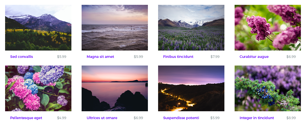
HTML:
<ul class="row products">
    <li>
        <a href="#">
            <img src="..." />
            <b class="name">Sed convallis</b>
            <span class="price">$5.99</span>
        </a>
    </li>
    ...
</ul>
CSS:
.products {
    justify-content:space-between;
    flex-flow:row wrap;
}
.products li {
    width:300px;
    margin-bottom:30px;
    list-style:none;
}
Note as well that the items inside each of these tiles can be set up using flex box tiling. The three items—image, name, price—have a predictable pattern of size. The image fills the "row" while the name and price sit beside each other. Check out the simple settings to achieve this:
.products li {
    width:300px;
    margin-bottom:30px;
    list-style:none;
    display:flex;
    justify-content:space-between;
}
.products img {
    width:100%;
    margin-bottom:20px;
}
.products .name {
    margin-left:10px;
    width:195px;
}
.products .price {
    margin-right:85px;
}
Centered tiles
Following the same idea as in B4, tiles inside can easily be centered by placing justify-content:center on the row.
Tile exceptions
Chances are that the item at the beginning or end of each row will need some overrides applied in order to achieve the desired effect. First apply desired overall tile settings for width, height, margin, and padding.
In order to affect the first item on each row in the tile set you can use this formula for the pseudo-class selector...
tile_item_selector:nth-child(xn+1) { ... }...where x is the number of items in a row.
To affect the last item in each row in the tile set use this formula for the pseudo-class selector...
tile_item_selector:nth-child(xn) { ... }...where x is the number of items in a row.